2013 Theme
This new one-column theme is great for media-rich content. It puts the focus on content and includes a flexible layout that is responsive on any size of device. The default location of widgets has changed.
 |
 |
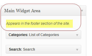
The Main Widget Area now defaults to the footer area. The Secondary Widget Area will show up on the side.
Main Widget Area in Footer

Track Revisions
WordPress 3.6 makes it much easier to view and select previous versions. As of WordPress 3.6, there is now a side-by-side comparison. Let’s go through the steps.

Select a revision from the revision window on the page editing screen.
The next screen compares side-by-side the current version (on right) with the revision you selected. This is the note worhty change from previous versions of WordPress which just showed you the selected revision.

This revision screen has a lot more options than just comparing the current version with the selected version. See the image below with the explanation below it.

1 – Contents of selected revision (on left), Contents of current version (on right)
2 – Gives date/time of the selected revision
3 – Click Previous or Next to select a different revision
4 – Also select desired revision by clicking on one of the small rectangles (number of rectangles indicate number of revisions available) or by clicking and dragging the arrows.
5 – Compare any of the revisions side-by-side. See image below.
6 – Click to restore the indicated revision.

When the option for ‘compare two revisions’ (#5 above) is selected, the small rectangles at the top of the page change slightly. There are now two arrows (gray for revision on left, blue arrow for revision being shown on right) indicating which revisions are being displayed. Click and drag the desired arrow to select a different revision.
If you want to select a previous revision, just click on the Restore This Version button (#6 above).
Better Autosaves
The autosave function has improved. Whether your power goes out, or your browser crashes, the improved authosave keeps your content safe. WordPress now makes use of browser-level storage to add this enhancement. Edits are stored locally. Then, if the browser crashes or the internet connection is lost, everything is synced back to WordPress as soon as possible. Even so, I still highly recommend ‘safe often!”
Locking Posts with Multiple Authors

If someone else is editing a page or post, their name shows up with that page. You can still edit the page. The following popup window will appear:

A really nice feature is the option to preview. This will show you the current changes the person is making that has this page checked out. You can get out (go back) or choose to Take Over. If you Take Over, you will get the current saved version of the page without the changes the person is making. However, the other person will receive a popup window indicating this page has been ‘taken over’:

New Media Player
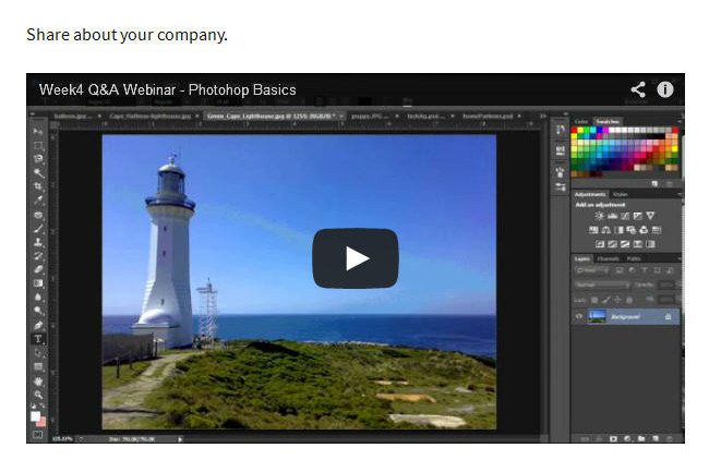
Share Audio and Video with the new built-in HTML5 media player. Automatic embedding has been improved without reliance on external services.

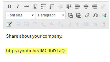
Simply type in the URL for the video and audio. It will automatically use the media player when viewed.
Embed Music
You’ve been able to embed Videos and Images from various services including Flickr, Instagram, SlideShare, SmugMug, Vimeo, YouTube, and others. In WordPress 3.6, it is now easy to embed songs and albums, or playlists from your favorite artists by pasting the URL into your posts. WordPress supports this embed option from multiple services including Spotify, Rdio, and SoundCloud.
Menu Editor
The menu editors is more intuitive. For those used to the previous version, it does take a bit of getting used to.

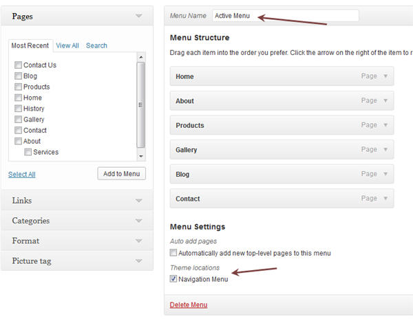
At the top left of the Menu page is a drop down menu to select a menu to edit, or an option to create a new menu.

The Menu page in WordPress 3.6 is just a bit different than previous versions. The various windows on the left side now appear to the immediate left of the menu being edited. In previous versions, the same boxes appeared on the left side but one had to scroll down to see them.
The menu being edited is indicated above the Menu Structure area. (top red arrow) Menus continue to be edited within the Menu Structure area just as before – click and drag to define order of menu and to create 2nd level menus. Below the Menu Structure area are the Menu Settings. The navigation menu option within Menu Settings is the option that makes current menu the active menu.
What new features do you like in WordPress 3.6? Which ones do find most beneficial?

