Mind Your Characters: Web Typography
Over the years, I've seen the same web typography mistakes repeated across hundreds of sites. Paying attention to a few details sets your site apart from the rest. Here are the most common ones — and how to fix them.
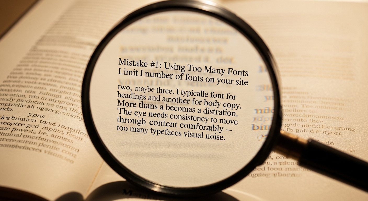
Mistake #1: Using Too Many Fonts
Limit the number of fonts on your site to two, maybe three. I typically use one font for headings and another for body copy. More than that becomes a distraction. The eye needs consistency to move through content comfortably — too many typefaces creates visual noise.
Mistake #2: Two Spaces After a Period
In the typewriter era, we were taught to use two spaces after a period. Typewriters used monospaced fonts where every character took the same amount of space — the extra space compensated. Modern fonts are proportionally spaced, so the extra space creates an awkward visual hole in the text. Use one space after a period.
Mistake #3: Using a Hyphen Instead of an Em Dash or En Dash
In web content, we often just reach for the hyphen key. Technically, there are more precise characters available.
An em dash (—) indicates a sudden change of thought or an interruption. HTML code: — or —
I was reading a book about—what time did you say it was?Result: I was reading a book about—what time did you say it was?
An en dash (–) indicates a range of numbers, dates, or values. HTML code: – or –
Anybody from 5–11 years old may participate.Result: Anybody from 5–11 years old may participate.
Mistake #4: Straight Quotes Instead of Curly Quotes
The quote key on your keyboard produces straight quotes (" "). Proper typographic quotes are curly — they open and close in the direction of the text. HTML codes:
- Left double quote:
“or“— " - Right double quote:
”or”— " - Left single quote:
‘— ' - Right single quote / apostrophe:
’— '
Do I Have to Remember These Codes?
No — most HTML editors handle this for you. WordPress's visual editor automatically converts straight quotes to curly quotes as you type. Look for the special characters icon in your editor's toolbar (often resembling a horseshoe or omega symbol) for less common characters.