Background Colors and Gradients in CSS
We've covered adding background images to web pages — both as a full-page background and as backgrounds for boxes within the page. In this post, let's look at background colors (which we've touched on already) and using gradients as backgrounds.
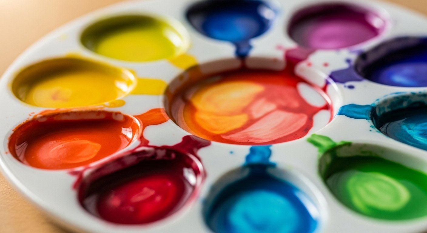
Background Colors
Background color is a CSS property we can apply to the entire page, or to any box (container) within the page. I often use solid background colors when first laying out a page — just so I can see where the different areas will be and verify they're positioning where I want them, before adding real content.
To fill the entire browser window with a background color:
body {{
  background-color: #009;
}}
The navy blue above will fill the entire browser window. We can do the same for any defined box:
#wrapper {{
  background-color: #FFF;
  width: 960px;
  margin: 0 auto;
}}
Now we have a white content area against the navy background. Continue applying background-color throughout your defined content areas to create visual structure.
Background Gradients: The Image Method
To add more interest and depth, gradients — or multiple colors in the background — work beautifully. One reliable approach: create the gradient design in Photoshop, then take a thin vertical or horizontal sliver of the gradient (just a few pixels wide) and save it as a small JPG. Then tile it across the page using CSS:
body {{
  background-image: url(images/background.jpg);
  background-repeat: repeat-x;
}}
The image repeats horizontally across the full width of the page, creating a gradient effect that's very small in file size.
CSS Gradients (No Image Needed)
Modern CSS can create gradients directly — no image required. A linear gradient from one color to another:
.section {{
  background: linear-gradient(to bottom, #2d4a3e, #1e2a25);
}}
For a more complex gradient with multiple color stops:
body {{
  background: linear-gradient(135deg, #f7f3ee 0%, #e8f0ec 50%, #c9943a22 100%);
}}
CSS gradients are now widely supported across all browsers and are preferred over image-based gradients for simple effects — they're faster, scalable, and easy to adjust.
Creative Possibilities
You can repeat an image or gradient down the page vertically (background-repeat: repeat-y), show it only once in a specific position (background-repeat: no-repeat), or use it to fill just a portion of a container. The possibilities are many — have fun creating.