Duotone Image Mode in Photoshop
A duotone is an image made up of two colors instead of a full color palette. Originally a printing technique using two ink plates, duotones have become a popular design choice for their bold, graphic quality. Photoshop offers two ways to create them — a traditional mode-based method and a more flexible layer-based approach.
Method 1: Image Mode Duotone (Traditional)
This is Photoshop's built-in Duotone mode. It produces a true duotone that can be used for print production with specific ink specifications.
Step 1: Convert to Grayscale
Go to Image > Mode > Grayscale. Photoshop will discard color information. For best results, use the Black & White adjustment (Image > Adjustments > Black & White) before converting — this gives you control over how each color in the original maps to gray.
Step 2: Convert to Duotone
Go to Image > Mode > Duotone. The Duotone Options dialog opens. Change the Type dropdown from Monotone to Duotone.
Step 3: Choose Your Two Colors
Click each color swatch to open the Color Picker. Click Color Libraries to select from Pantone or other ink systems for print work. For digital, choose any two colors you like. Darker colors work best in Ink 1 (top), lighter in Ink 2.
Step 4: Adjust the Curves
Click the curve thumbnail next to each ink to adjust how that color distributes across the image's tonal range. The default straight diagonal means equal distribution. Experiment with the curve to push color into shadows, midtones, or highlights.
Method 2: Gradient Map (More Flexible)
This non-destructive method is often preferred for design work because it preserves your original image and is easy to adjust.
Create a Gradient Map Adjustment Layer
Go to Layer > New Adjustment Layer > Gradient Map. In the Properties panel, click the gradient bar to open the Gradient Editor. Set the left color stop to your shadow color and the right stop to your highlight color. The result is a duotone effect that maps your chosen colors across the image's tonal range.
The Gradient Map method has one big advantage: it's non-destructive. You can adjust or remove it at any time, and your original color image remains intact underneath.
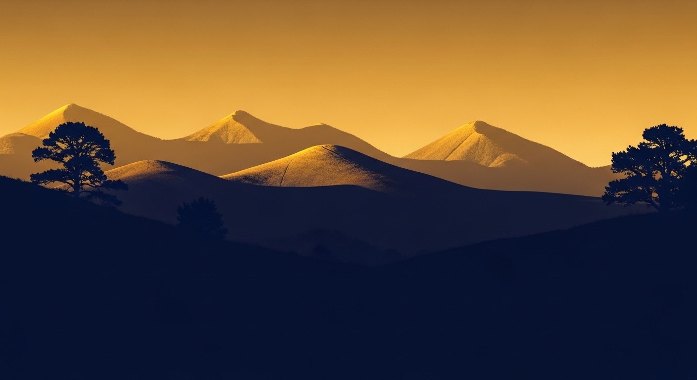
Choosing Colors
Strong duotone effects typically use colors with good contrast — a dark color for shadows and a lighter or more saturated color for highlights. Complementary color pairs (blue and orange, purple and yellow) create dramatic results. Analogous pairs create subtler, more cohesive effects.