In the last post we covered how to create boxes within CSS. Let’s expand that and discuss how we do nested boxes – which is most likely how we will be using boxes within a webpage layout. One box for the entire page, then a collection of boxes within the main box. (By the way, I use the word box. It’s the same as container – which is a common term within the CSS world.) In this post we will just discuss ‘seeing’ the boxes. In the next post, we’ll look at the CSS to create the boxes.
If we don’t accurately see the boxes, we’ll go into CSS without the full picture, and not properly prepared. My experience has been without being rightly prepared, frustration sets in very quickly.
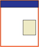
Let’s say we want the following layout:

Let’s discuss each of the four boxes.
The Outer Box
 This box includes everything. It’s the wrapper or the container for the rest of the boxes.
The Header Box
 This one is the obvious one. It’s the box at the top of the page. This is where the header of the web page will reside.
The Content Box
 This is the entire area below the header. This is the one box that might be optional. We don’t necessarily need this box, yet I have found that including this box will give me more options for placing more boxes within this area, should I decide to do so.
One of the keys in ‘seeing’ the boxes is seeing them in such a way to allow for flexibility. What if we decide to add a box on the left side (for navigation)? Declaring this content box allows for those kinds of options to be added quickly and efficiently at a later date.
The Right Side Box
 This is the other obvious box.
With CSS we will be able to place this box exactly where we want it within the Content Box.
We’ll look at the CSS to create these boxes (also known as a page layout) next time.
In the mean time, try your hand at looking at seeing the boxes. Visit different websites. Draw out common page layouts. Do you see the boxes? How many boxes are there?
